Case Study
Reducing Onboarding Drop-offs During Document Upload / Verification.
Role:
Product | UI/UX Designer
Skills:
UX/UI design, research analysis, prototyping, and iterative design.
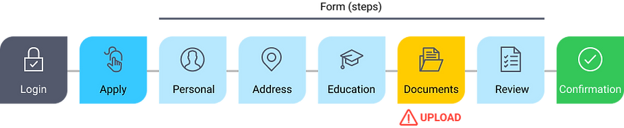
1 | Overview
Problem:
Users drop off during the document upload/verification step. For applicants this is a high friction point during onboarding process/flow and was leading to dropping out.
Possible causes:
-
Unawareness of required documents.
-
Using incorrect documents.
-
Generating wrong format or low-quality document images.
Goal:
To redesign the document verification process to reduce drop-offs, improving clarity and usability, and enhance the overall user experience.
2 | Research Phase
User Research:
Conducted interviews and usability tests with users who had attempted document verification.
Key insights / pain points:
-
Users were unclear about which documents were acceptable before starting the process.
-
Instructions on document format were unclear (e.g., PDF, image).
-
Some users lacked the required documents and didn’t know how to proceed.
-
Missteps led to frustration and drop-offs (e.g., uploading an incorrect document or low-quality documents).
-
The app provided no clear guidance on resolving errors.
Competitive Analysis:
Reviewed similar document verification flows in apps like ID.me, Dropbox Sign, Stripe and PayPal.
Identified effective practices:
-
Previewing acceptable documents.
-
Pre-upload checklists.
-
Real-time feedback on document quality.
-
User-friendly fallback options.
3 | Problem Statement
Primary Problem:
Users drop off because they don’t know which documents are required or upload the wrong documents.
Design Goal:
Simplify the document verification process by providing clear, upfront guidance, so they can seamlessly complete document verification without confusion or frustration.
4 | User Personas
Persona 1: Sarah, The Planner
-
Tech-savvy user who expects clear and fast instructions.
-
Pain Point: Wants to prepare documents but doesn’t know what’s needed in advance.
-
Goal: Complete the process without surprises.
Persona 2: John, The On-the-Go User
-
Non-tech-savvy user who needs step-by-step guidance and reassurance.
-
Pain Point: Uploads blurry or incorrect documents in a hurry.
-
Goal: Receive immediate feedback to fix issues without abandoning the application.
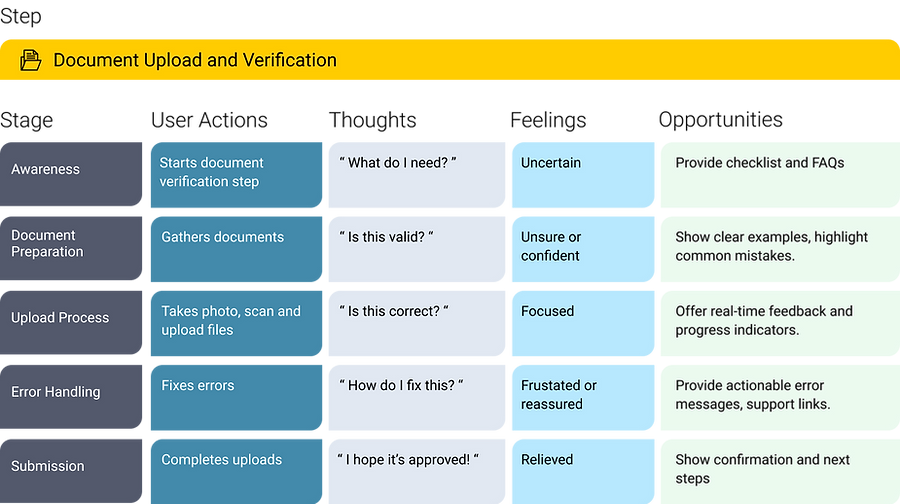
5 | User Journey Mapping
Current Flow Pain Points:
Step 1: Users reach the verification step without knowing what’s required.
Step 2: They upload an incorrect or low-quality document.
Step 3: Error messages lack clarity, leading to frustration and drop-offs.
Proposed Flow Enhancements (Brainstorming Solutions):
Step 1: Introduce a pre-verification checklist to inform users of acceptable documents. Include visual examples of acceptable documents (e.g., driver's license, passport).
Step 2: Add real-time feedback for incorrect uploads (e.g., “This document is blurry”).
Step 3: Offer actionable error messages and alternative steps for users without the required document (e.g., Defer verification or use another form of ID).
.
6 | Ideation Phase
Key Features:
-
Document Preparation Screen:
-
A checklist detailing required documents with visual examples.
-
An FAQ section for common questions (e.g., “What if I don’t have a driver’s license?”).
Guided Upload Interface:
-
Step-by-step instructions for taking or uploading a document (e.g., “Take a photo of your government-issued ID”).
-
Tool-tips for correct framing, focus, and lighting.
Real-Time Feedback:
-
Instant feedback for common issues like blurriness or incorrect documents.
-
Error messages with actionable advice (e.g., “This image is too dark. Please retake it in good lighting.”).
Fallback Options:
-
Allow users to save progress and return later.
-
Offer alternative verification methods (e.g., a video call with support).
7 | Design Phase
Wireframes:
-
Low-fidelity sketches to define key screens:
Step 1: A pre-verification screen with a checklist and visuals of acceptable documents.
Step 2: A simplified upload interface with clear instructions (e.g., “Take a photo of your government-issued ID”).
Step 3: Real-time feedback messages (e.g., “The image is too blurry—please retake it”).
High-Fidelity Mockups / Prototyping:
-
Created polished designs in Figma with a focus on usability and accessibility.
Accessibility Considerations:
-
Ensured text and visual elements met WCAG 2.1 standards.
-
Used large, tappable buttons for easy navigation
8 | Testing and Iteration
Usability Testing:
-
Key findings after conducting the prototype test with 10 users.
Before Upload: 90% of users found the checklist helpful and felt prepared.
“The checklist made it easy to prepare documents beforehand.”
During Upload: Users appreciated the real-time feedback feature.
“I liked the immediate feedback on my photo—it saved time.”
Post Upload: 80% completed the process without errors or frustration.
Iterations:
-
Simplified error messages for better clarity.
-
Added a progress bar to reduce anxiety about remaining steps.
-
Enhanced visual examples to include edge cases (e.g., expired IDs).
9 | Outcomes and Impact
Metrics:
-
Drop-off Rate: Reduced from 40% to 15%.
-
Error Rate: Decreased by 30% due to real-time feedback.
-
75% of users completed verification on the first attempt (up from 50%).
-
Error-related support tickets decreased by 30%.
-
User Satisfaction: Improved based on post-implementation surveys.
Qualitative Feedback:
“I loved the checklist; it made me feel confident I had the right document.”
“The feedback made the process feel smoother and less frustrating.”
“I felt much more confident knowing what was needed before starting.”
10 | Learning and Next Steps
Key Takeaways:
-
Providing upfront guidance and visual examples significantly improved user understanding.
-
Providing upfront clarity reduces user anxiety.
-
Real-time feedback fosters user confidence and prevents errors.
Next Steps:
-
Monitor long-term engagement metrics.
-
Explore AI-powered document recognition for faster feedback.
-
Consider adding a chatbot for real-time assistance.
-
Roll out similar improvements for other app flows.
11 | Conclusion
By addressing user pain points with clear instructions, user-friendly document verification process, visual aids, real-time feedback, the redesigned document verification flow significantly reduced drop-offs and improved overall satisfaction.
This case study highlights the importance of understanding user needs and iterating for clarity and usability.
** 2024